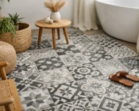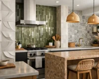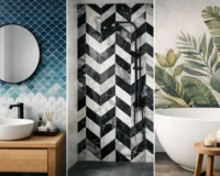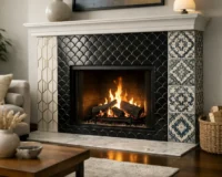
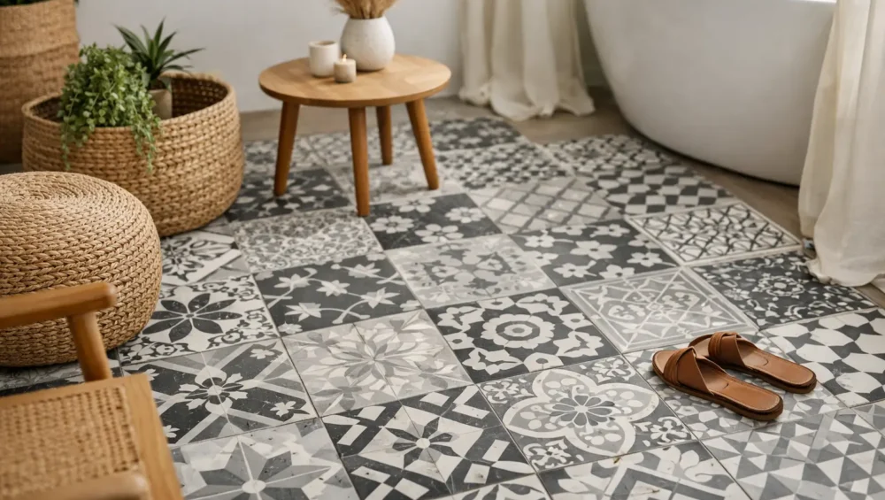
Patterned floor tile has a rare ability to make an ordinary room feel considered from the ground up. The question of how to style patterned floor tiles is less about matching every finish perfectly and more about creating the right visual hierarchy: the floor can lead, while the rest of the room gives it space to shine.
Whether you are designing a dramatic powder room, a hardworking kitchen, or a welcoming entryway, patterned tile brings personality, movement, and architectural depth to the space. The most successful rooms balance that decorative impact with quieter surfaces, practical material choices, and furnishings that feel intentional rather than overly coordinated.
Let the Floor Set the Design Direction
A patterned floor is not simply a finish. It is a design statement with its own color palette, rhythm, and scale. Before choosing wall tile, cabinetry, paint, or fixtures, identify what the tile is already doing visually.
A soft, low-contrast pattern in warm ivory, taupe, and stone can become the foundation for a relaxed Mediterranean, coastal, or organic-modern interior. A high-contrast black-and-white geometric design feels sharper and more tailored, pairing naturally with crisp painted walls, warm timber, and classic metal finishes. Rich blue, green, terracotta, or ochre motifs can inspire a more expressive scheme while still feeling elevated when the supporting materials are restrained.
Choose one or two colors from the tile to repeat elsewhere in the room. That repetition may be subtle: a vanity painted in the deepest shade of the pattern, brass hardware that echoes its warm undertones, or linen towels in a softened version of the tile’s accent color. This creates continuity without making the room feel themed.
Balance Pattern With Quiet Surfaces
The most common mistake with patterned flooring is asking every surface to compete. When the floor has movement, walls and large furnishings usually benefit from a calmer treatment.
In a bathroom, consider pairing a decorative floor with full-height white, cream, or lightly textured wall tile. A handmade-look ceramic can add character without introducing another strong graphic. In a kitchen, a patterned tile floor may sit beautifully beneath simple shaker cabinetry, a restrained stone-look backsplash, and countertops with gentle veining rather than dramatic movement.
This does not mean every surrounding finish must be plain. Texture is different from pattern. Fluted timber, honed natural stone, plaster walls, ribbed glass, and woven textiles can give a room richness while allowing the floor to remain the visual focal point.
If you do want to combine patterns, vary their scale. A large-format floral or geometric floor can work with a small, quiet stripe in window treatments or a softly mottled stone surface. What matters is that the patterns do not have equal visual weight. One should always feel dominant.
Use Solid Fields to Frame the Tile
Patterned floor tiles are especially effective when they are framed by solid materials. In an open kitchen or living area, this may mean using the patterned tile to define the kitchen zone, then transitioning to timber or a neutral large-format porcelain in adjacent spaces. In a bathroom, a simple wall tile creates a clean field around the patterned floor.
Borders can also bring order to a bold design. A plain tile perimeter around the room can make a decorative center feel deliberate, particularly in entries, laundry rooms, and small bathrooms. This approach is ideal when the tile pattern is detailed or when the room has multiple doorways and irregular edges.
Choose Scale for the Room, Not Just the Sample
A tile sample can make a bold pattern look more intense than it will appear across an entire floor. Conversely, a delicate motif may lose impact in a large open room. Scale should be assessed in relation to the room’s dimensions, sightlines, and furniture layout.
Small powder rooms and laundry rooms are excellent places to take a design risk. Because these spaces are compact, a patterned porcelain or encaustic-inspired tile can create a memorable moment without overwhelming the home. In a larger kitchen or entry, look for designs with more open ground color or a repeating motif that reads as texture from a distance.
Tile size matters, too. Smaller patterned tiles can feel intricate and artisanal, while larger-format decorative tiles often create a cleaner, more contemporary effect. For rooms with many cuts around cabinetry, toilets, or islands, consider how the pattern will land at edges. A balanced layout planned before installation helps avoid thin, awkward-looking cuts that interrupt the design.
Ordering samples is one of the most valuable steps in the selection process. View them against cabinetry, paint, and natural light at different times of day. A tile that looks charcoal under showroom lighting may reveal warm brown or blue undertones in your home.
Build a Cohesive Color Palette
When styling patterned floor tiles, choose a palette that supports the tile rather than trying to introduce every color found within it. A three-part approach works well: a primary neutral, one material tone, and one accent pulled from the floor.
For example, a tile featuring sand, charcoal, and muted sage could be paired with warm white walls, natural oak cabinetry, and aged brass fixtures. The sage may appear only in a hand towel, framed artwork, or a painted internal door. This gives the room depth while preserving a refined, edited look.
Black-and-white tiles offer enormous flexibility, but they can feel cold if every finish is equally crisp. Introduce warmth through oak, walnut, rattan, off-white paint, or unlacquered brass. Similarly, terracotta and earth-toned patterns can be made more contemporary with matte black fixtures, creamy plaster walls, and simple sculptural lighting.
Grout belongs in the color conversation. Matching grout creates a more continuous, expansive floor, particularly with busy patterns. A contrasting grout emphasizes each tile and suits clean geometric layouts, but it can make a detailed pattern appear busier. For most decorative floors, a grout shade close to the tile’s dominant background color is the more timeless choice.
Match the Material to Daily Life
The visual appeal of a patterned tile should be matched by performance appropriate to the room. Porcelain is a highly practical choice for busy kitchens, entryways, bathrooms, and commercial settings because it is durable, low-absorption, and easier to maintain. Many premium porcelain collections recreate the character of encaustic cement tile while offering a more forgiving option for daily use.
Authentic encaustic cement and natural stone have exceptional depth and character, but they require more care. These surfaces may need sealing and should be cleaned with products suitable for the material. They are ideal for projects where patina is part of the appeal and where the owner is comfortable with thoughtful maintenance.
For wet areas, confirm that the selected tile has suitable slip resistance and that the installation details support safe use. Smaller tiles can offer more grout lines underfoot, which may be beneficial in shower zones, while a larger patterned tile can make a bathroom floor feel more expansive. It depends on the tile finish, the area’s exposure to water, and the overall design intent.
Furnish Around the Pattern, Don’t Cover It
A beautiful patterned floor deserves to be seen. In a small bathroom, choose a wall-mounted vanity or furniture with slim legs so more of the surface remains visible. In an entry, use a narrow console rather than a heavy storage unit that hides the tile’s best detail. Rugs should be used selectively, especially where they are needed for comfort or protection, but avoid covering the entire design.
Furnishings with clean silhouettes generally pair best with decorative floors. The tile provides enough ornament, so a streamlined vanity, simple upholstered bench, or sculptural pendant can create contrast and keep the scheme current. If the room leans traditional, bring in classic forms through a framed mirror or panel-front cabinetry rather than adding multiple decorative prints.
Lighting can change the way patterned tile is perceived. Warm, layered lighting enhances the depth of earthy cement looks, while brighter, cleaner lighting suits crisp monochrome or coastal blue-and-white designs. In windowed spaces, pay attention to glare from glossy finishes. A matte tile often gives a softer, more sophisticated result in areas with strong natural light.
Create Intentional Transitions Between Rooms
Patterned flooring feels most luxurious when it has a clear purpose. Use it to mark an arrival zone, define a kitchen within an open plan, or turn a bathroom into a destination. When transitioning to another flooring material, aim for a clean line at a doorway, island, or architectural threshold rather than letting patterns drift into every adjacent room.
For a more connected home, repeat a color or finish instead of repeating the exact tile. A terracotta accent in the entry can relate to a warm stone backsplash in the kitchen. A navy-and-cream bathroom floor can connect to blue cabinetry or artwork elsewhere. This approach gives each room its own identity while maintaining a polished whole-home story.
The right patterned tile does more than decorate a floor. It gives the room a point of view. Start with a design that suits the way the space will be used, order samples to see its true character in place, and let the surrounding finishes support its presence with confidence.