A feature wall is often the surface that gives a room its identity. It can frame a freestanding bath, bring depth to a restrained kitchen, or turn a commercial entry into a memorable first impression. The right feature wall tiles do more than introduce color or pattern – they create a focal point with permanence, texture, and a level of finish paint rarely achieves.
For a result that feels considered rather than overdone, begin with the room’s architecture, light, and daily demands. Premium tile makes a statement because of how it is selected and installed, not simply because it is bold.
What Makes Feature Wall Tiles So Effective?
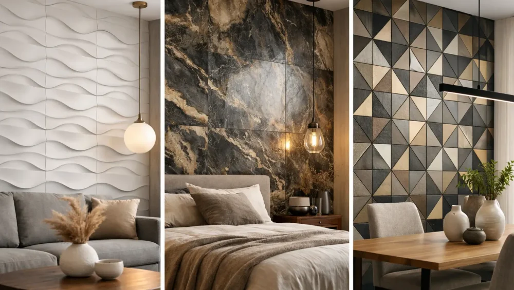
A tiled feature wall has visual weight. Grout lines establish rhythm, surface texture changes as daylight moves across it, and the material creates a clear contrast against surrounding finishes. This makes tile particularly powerful in spaces that need definition without adding more furniture or decoration.
In a bathroom, a feature wall behind the vanity or tub can establish a calm, hotel-inspired atmosphere. In a kitchen, a full-height tiled wall can make open shelving, a range, or a dining nook feel intentional. In living areas, fireplaces and media walls benefit from the tactile quality of stone, porcelain, or dimensional ceramic.
Tile also has a practical advantage over many decorative wall treatments. Suitable products offer excellent durability, easy cleaning, and lasting color stability. For high-touch spaces, wet areas, and busy commercial interiors, that combination of beauty and performance matters.
Start With the Wall, Not the Tile
The most successful feature walls respond to a room’s strongest architectural moment. Before falling in love with a sample, consider what the wall is already doing.
A wall behind a bed, bath, fireplace, reception desk, or dining table is naturally suited to becoming a focal point. A narrow return wall, an awkward corner, or a wall interrupted by multiple doors may need a quieter finish instead. Feature tiling works best when it has room to read as one complete composition.
Think about viewing distance as well. A richly veined porcelain slab or large-format stone-look tile is often most effective when seen from across a room, where its movement can be appreciated. Small mosaics reward closer viewing and suit shower niches, vanity walls, and intimate powder rooms. If a wall is visible from several rooms in an open-plan home, choose a finish that complements each sightline rather than competing with them.
Lighting deserves equal attention. Glossy tiles reflect light and can add energy to a darker room, while matte, honed, or textured finishes absorb light for a softer, more architectural effect. Always view samples vertically and at different times of day. A color that appears warm under showroom lighting can shift noticeably beside cool daylight, timber cabinetry, or a charcoal stone countertop.
Choose a Material That Matches the Space
Material selection should balance visual ambition with the realities of the room. There is no single best option – the right choice depends on moisture, maintenance expectations, installation conditions, and the effect you want to create.
Porcelain for refined, everyday performance
Porcelain is a versatile choice for feature walls because it can deliver the appearance of natural stone, concrete, marble, metal, or timber with reliable durability and simple maintenance. Large-format porcelain tiles create a clean, expansive look with fewer grout lines, making them especially compelling in contemporary bathrooms, kitchens, and commercial settings.
Stone-look porcelain provides the drama of veining without the variation in care requirements associated with some natural materials. It is a practical choice when the wall will sit near splashes, steam, cooking residue, or heavy daily use.
Natural stone for genuine character
Natural stone brings depth that cannot be replicated exactly. Marble, travertine, limestone, and slate each carry individual variation in tone, veining, and texture, giving a feature wall a distinctly elevated finish. It is particularly suited to powder rooms, fireplaces, entryways, and luxury hospitality spaces where material authenticity is central to the design.
The trade-off is that natural stone requires a more informed approach to sealing, cleaning, and product selection. Some stones are more porous or sensitive than porcelain, particularly around wet areas or food preparation zones. A suitable sealer and professional installation help protect the investment while preserving the stone’s natural beauty.
Ceramic and mosaic for color, shape, and detail
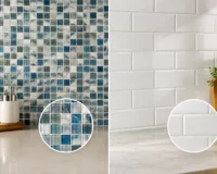
Ceramic wall tiles offer an exceptional range of glazes, profiles, and colors. A handcrafted-look subway tile, scallop shape, finger mosaic, or zellige-inspired finish can introduce movement without relying on a loud palette. Their variation is often the point: subtle shifts in glaze make the wall feel layered and alive.
Mosaics are ideal for feature moments that call for intricate detail. They can wrap a curved wall, line a recessed niche, or bring a jewel-like finish to a bar front. Because mosaic sheets contain more grout joints, consider grout color early. A matching grout creates a continuous effect, while contrast emphasizes the tile’s geometry.
Scale, Layout, and Grout Shape the Final Look
A tile may be beautiful on its own, yet its layout is what turns it into a feature. Larger tiles usually create a quieter, more luxurious plane, while smaller formats make pattern and texture more visible. Neither is automatically more premium – the scale needs to suit the wall.
For a tall wall, vertically stacked rectangles can emphasize height. A horizontal layout can make a compact bathroom or narrow kitchen feel broader. Herringbone, basketweave, and chevron arrangements introduce movement, but they demand precise setting out and can create more cutting waste. Use them where the pattern will be visible rather than hidden behind mirrors, appliances, or furniture.
Grout should never be an afterthought. Tonal grout lets stone, texture, and color lead the design. Contrasting grout makes every tile edge more graphic, which can look striking with simple square or subway tiles but may feel busy beside strong veining or a highly varied glaze. In wet areas, choose a grout system designed for the application and maintain it according to the manufacturer’s recommendations.
For full-height walls, ask your installer to plan the layout from the center line and key focal points. Avoid narrow tile cuts at exposed edges where possible. A balanced layout, neatly finished corners, and well-placed trims are often what separate a polished result from a merely acceptable one.
Design Ideas for Different Rooms
In bathrooms, the wall behind a freestanding tub is a natural canvas for stone-look porcelain, fluted tile, or a calm mosaic. Continue the tile to the ceiling for a more immersive finish, especially in rooms with limited wall space. If you want a quieter luxury, use one tonal palette and let texture create the contrast.
In kitchens, feature tiling can extend beyond the traditional backsplash. Consider a full wall behind open shelves, a deeply glazed tile around a range, or a large-format slab behind a dining banquette. Keep the relationship with cabinetry in mind: highly patterned tile often works best with simpler cabinet fronts, while a restrained tile can support richly grained timber or dramatic stone counters.
For living rooms, fireplaces, alcoves, and media walls benefit from finishes with depth. Travertine-look porcelain, natural stacked stone, or textured oversized tiles can add substance without making the room feel cluttered. Where a television will be mounted, plan cable access and mounting requirements before installation.
In commercial interiors, durability and brand expression should work together. A reception wall might call for a large-format marble-look porcelain that feels polished but is easy to maintain. Restaurants, retail spaces, and wellness settings may benefit from tactile mosaics or handcrafted-look ceramics that create a memorable atmosphere at close range.
Avoid the Common Feature Wall Mistakes
The most common mistake is treating a feature wall as a disconnected decorative gesture. A bold tile still needs to relate to the flooring, joinery, hardware, and paint colors around it. Pull one tone from the tile into another finish, whether that is a warm metal, timber undertone, or soft neutral wall color.
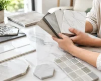
Another is choosing a finish based only on a small sample. Samples are essential, but natural variation, tile direction, grout, and wall size all influence the final effect. Order enough samples to view next to each other, especially when considering veined porcelain, natural stone, or artisanal ceramic. For projects with distinct batches or pronounced variation, confirm quantities before installation begins.
Finally, do not overlook the substrate and installation. Walls must be properly prepared, flat, and suitable for the tile format. Heavy stone, oversized porcelain, and three-dimensional products may require specific adhesives, fixing methods, or additional support. A premium surface deserves an installer experienced with the material and the level of detail you expect.
A feature wall should feel like it belongs to the room from the moment you enter it. Browse materials with the full scheme in mind, order samples, and let the tile’s scale, texture, and finish guide a design that remains exceptional long after the renovation is complete.