A tile can look perfectly balanced on a screen, then feel entirely different beside your cabinetry, paint, flooring, and natural light. That is why tile samples are not a minor step in the selection process. They are the moment a beautiful idea becomes a confident material decision.
For a bathroom renovation, a new kitchen, or a large commercial fit-out, the right surface has to do more than photograph well. It needs to complement the room’s proportions, perform in its intended setting, and create the level of detail your design calls for. Viewing a sample in person lets you assess all of this before committing to a full order.
Why Tile Samples Matter in a Finished Space
Tile is rarely seen in isolation. Its color shifts against surrounding surfaces, its texture responds to daylight, and its scale becomes more or less pronounced depending on the room. A soft ivory porcelain may read warm in a sun-filled kitchen but cooler beneath LED lighting. A charcoal stone-look tile may feel sophisticated in a large open-plan space while appearing heavier than expected in a compact powder room.
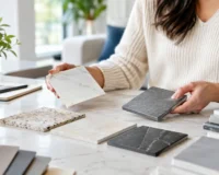
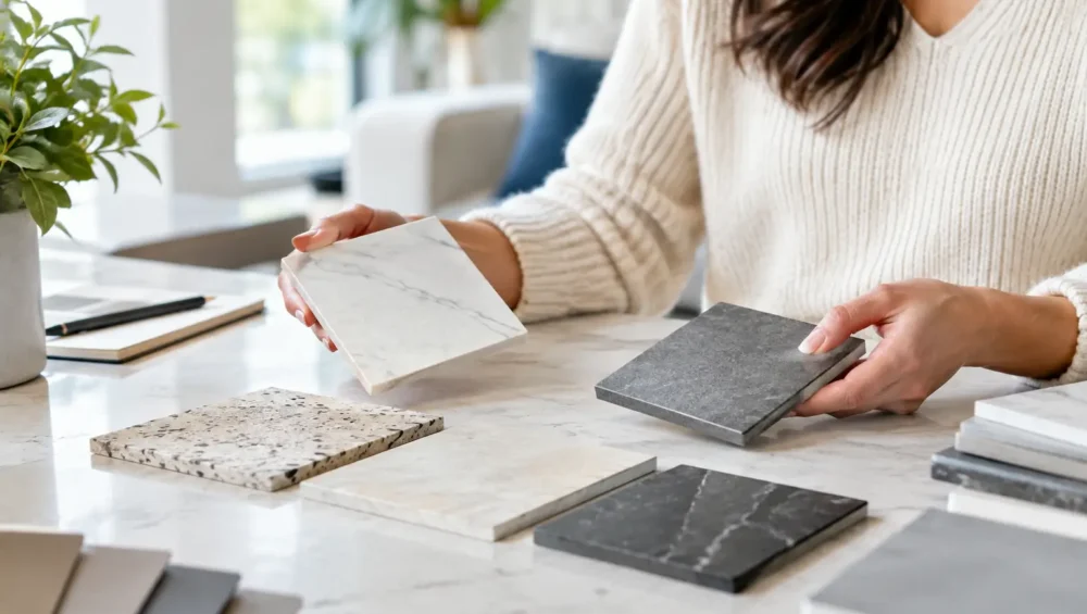
Samples give you the opportunity to see those relationships clearly. Place them beside cabinet doors, wall paint, countertop selections, timber finishes, and fabric swatches. Move them from bright daylight to evening light. This simple exercise often answers questions that product photography cannot: Does the undertone work? Is the finish too reflective? Does the pattern add character or visual noise?
For premium finishes, this step is particularly valuable. Natural stone, terrazzo, encaustic-inspired tile, and tiles with substantial movement are designed to have variation. That individuality is part of their appeal, but it also means one piece cannot represent every tile in an installation. A sample helps you understand the collection’s overall character, while product imagery and project inspiration can help you visualize the broader layout.
Start With the Room, Not Just the Look
The most successful tile selection balances visual direction with practical demands. Before comparing samples, consider how the room will be used and what the surface needs to handle.
In bathrooms and laundries, moisture, cleaning routines, and slip resistance should influence the finish you choose. A polished tile can bring a refined, luminous look to a wall, while a matte or textured option is often better suited to floors where grip matters. In kitchens, splashbacks can support more decorative color, gloss, or pattern, while floor tile should work with everyday traffic and the possibility of spills.
Outdoor areas require even more care. Exposure to rain, sun, temperature changes, and pool water can affect which materials and finishes are appropriate. A tile that looks exceptional indoors may not offer the performance needed for an exterior entertaining area. Samples allow you to assess the visual side of the decision, but the product’s suitability rating and installation requirements should always guide the final choice.
Large-format porcelain slabs and tiles bring a different consideration: scale. A small sample may convey the tone and surface finish, yet it cannot fully show how veining or movement will travel across a larger piece. If your design depends on a dramatic marble-look effect, look at full product images and completed-space references alongside the sample. The goal is to understand both the close-up detail and the room-wide impression.
How to Review Tile Samples at Home
Begin by bringing the sample into the exact room where it will be installed. Hold it vertically for wall applications and lay it flat for floors, because light catches each orientation differently. View it in morning sun, afternoon light, and at night with the lights you plan to use most often.
Color deserves a slower look than most people expect. White tile can carry pink, gray, cream, blue, or green undertones that only become apparent when paired with other finishes. The same applies to beige, taupe, and gray surfaces. A warm greige porcelain can create a calm connection with oak cabinetry, while a cooler gray may better suit crisp white joinery and brushed nickel fixtures. Neither is universally better. It depends on the mood and materials already shaping the room.
Texture is equally influential. Run your hand across the sample and notice whether it feels smooth, grainy, structured, or softly undulating. A handmade-look ceramic tile can bring depth and a gentle play of light to a backsplash. A rectified porcelain with a clean matte finish may create the restrained, architectural look required for a contemporary floor. Texture can also change maintenance expectations, especially in shower floors, entryways, and outdoor settings where dirt and water may collect.
Then consider reflectivity. Gloss finishes bounce light and can make a smaller room feel brighter, but they tend to reveal water marks and fingerprints more readily. Matte finishes offer a quieter, more grounded appearance and are often forgiving in high-use areas. Satin and honed-look finishes sit between the two, offering a subtle sheen without a mirror-like effect.
Compare Scale, Grout, and Edge Detail
A tile sample shows the material, but a finished installation is also shaped by grout lines and layout. This is where a design can shift from polished to busy very quickly.
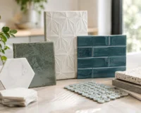
Small mosaics create detail, grip, and flexibility around curves or shower falls, yet their additional grout lines introduce more visual activity. Larger tiles can make a room feel more expansive and reduce grout joints, but they may require thoughtful planning around cuts, drainage, and room dimensions. Neither format is automatically more luxurious. The right choice is the one that supports the architecture of the space.
When reviewing samples, place a narrow strip of paper or a grout color card beside the tile to imitate the joint. A tonal grout can create a quieter, more continuous surface. A contrasting grout outlines each tile and makes the pattern part of the design statement. This is especially important with subway tiles, geometric mosaics, patterned surfaces, and handmade-look collections.
Edge detail also matters. Rectified edges allow for tighter, more uniform grout joints and suit a crisp contemporary aesthetic. Pressed edges have a softer, more traditional character. In a space built around natural materials, a slightly imperfect edge may be exactly what gives the room its warmth. In a sleek apartment kitchen, precision may be the priority.
Use Samples to Test a Complete Palette
A premium interior is usually built through coordination, not exact matching. Your tile does not need to be the same color as every other finish. In fact, a room often feels more considered when materials vary in tone and texture while sharing a common warmth or undertone.
Create a small palette board with your tile sample, countertop selection, cabinet finish, wall paint, fixture finish, and any timber or fabric elements nearby. Step back and look at the grouping from a few feet away. If one element dominates too strongly, decide whether that is intentional. A statement patterned tile may deserve to lead the room, while a soft stone-look porcelain may be there to create a calm foundation for more expressive joinery.
For commercial projects, include the finishes that will experience the most direct interaction with the surface. Consider reception counters, furniture upholstery, signage, and lighting temperatures. A material that feels luxurious in a sample board should still support the durability, maintenance, and visual consistency the space requires over time.
When One Sample Is Not Enough
Ordering more than one option is often the fastest route to a better decision. Closely related finishes can look remarkably different once they are placed in the room. Compare two shades of white, two stone-look textures, or a matte and gloss version of the same colorway before narrowing the choice.
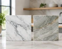
It is also wise to request additional samples when selecting natural stone or highly varied products. Expect differences in veining, mineral markings, and color movement. These are not flaws to eliminate. They are the details that give natural materials their depth and exclusivity. The question is whether the variation suits your design vision and whether you are comfortable embracing it across the full installation.
Mecca Tiles makes it easier to move from inspiration to a material choice by offering a curated range of design-led surfaces for every room. Once your samples have helped you identify the right tone, finish, and format, you can select with a clearer sense of how the final space will feel.
Place your shortlisted samples where you will see them for a few days, not just a few minutes. The surface that still feels right through changing light, daily routines, and second looks is often the one that will transform the room for years to come.