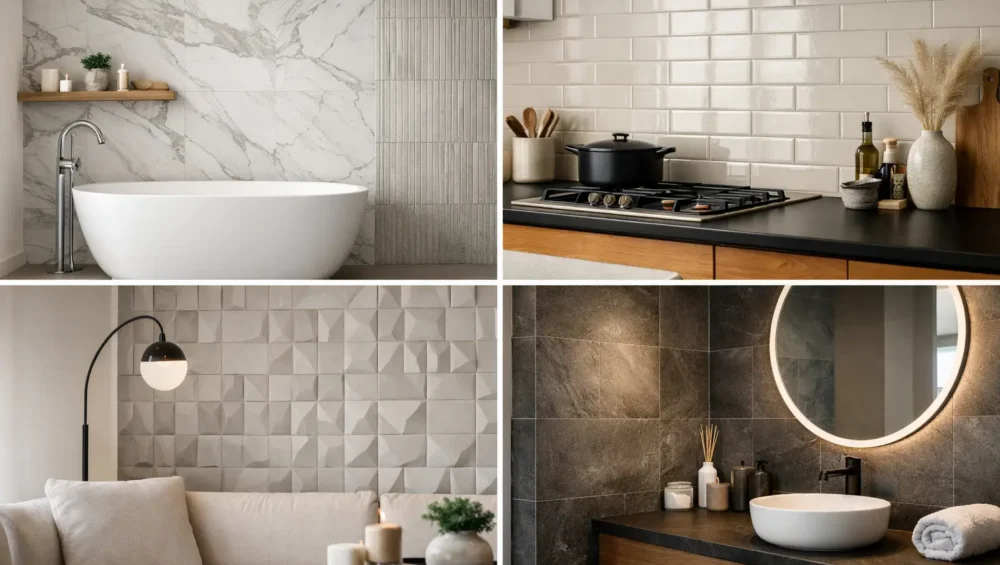
A wall finish has the power to change how a room feels before a single light is switched on. In a compact bathroom, ceramic wall tiles can create a sense of height and calm. Across a kitchen backsplash, they can introduce gloss, movement, or a precisely considered contrast to timber cabinetry and natural stone. Their appeal is not simply practical. Ceramic is one of the most expressive ways to give an interior a lasting point of view.
For homeowners and design professionals, the opportunity lies in choosing ceramic with intention. The right format, finish, grout color, and layout can make an everyday room feel tailored rather than merely finished.
Why Ceramic Wall Tiles Remain a Design Favorite
Ceramic tiles are formed from natural clay and fired to create a hard, durable surface. They are especially well suited to interior walls because they offer exceptional decorative range without asking you to compromise on easy care. From hand-finished zellige-inspired pieces to crisp subway tiles, soft matte squares, dimensional profiles, and dramatic large formats, ceramic brings color and texture to spaces that need both.
Unlike paint, a tiled wall has depth. Light catches a glazed surface differently throughout the day, while a satin or matte finish creates a quieter, more architectural effect. This makes ceramic a compelling choice for bathrooms, kitchens, powder rooms, laundries, fireplace surrounds, hospitality settings, and feature walls.
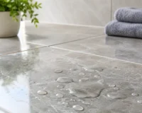
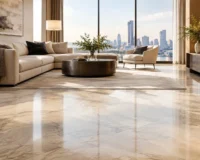
Ceramic also offers practical advantages where splashes and daily wear are expected. A properly installed tiled surface is easy to wipe down, resists moisture in suitable interior applications, and protects the wall behind it. That said, not every ceramic tile is designed for every setting. Wall-rated ceramic is generally not intended for floors, where higher impact resistance and slip performance may be required. For shower floors, outdoor walls, or high-exposure commercial environments, reviewing the product specifications before selecting is essential.
Choosing Ceramic Wall Tiles by Room
The room should guide the selection, but it should not limit the design ambition. Start with how the surface will be used, then consider the visual atmosphere you want to create.
Bathrooms: Create a considered retreat
Bathrooms are where ceramic often delivers its most transformative results. Glossy tiles can bounce light through a smaller room, making them especially effective in ensuites and powder rooms. Soft matte tiles, meanwhile, bring a more relaxed, spa-like character and pair beautifully with brushed metal fixtures, timber vanities, and natural stone.
For a full-height installation, large-format ceramic tiles reduce visible grout lines and create a calm, continuous finish. Smaller tiles can be equally luxurious when the intention is texture or pattern. A stacked square tile feels modern and graphic, while a vertical subway layout adds height to a low-ceilinged bathroom.
In wet areas, the quality of installation matters as much as the tile itself. Waterproofing, substrate preparation, grout selection, and sealing requirements should all be addressed with a qualified installer. A beautiful surface deserves the right foundation.
Kitchens: Make the backsplash work harder
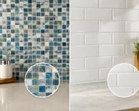
A kitchen backsplash is a relatively compact area, which makes it an ideal place to take a stronger design position. Ceramic tiles can introduce a rich color behind neutral cabinetry, soften a contemporary kitchen with handcrafted variation, or add polished contrast to a textured stone countertop.
Gloss finishes are popular for backsplashes because they reflect light and are easy to clean after cooking. If you prefer a more understated look, a satin or matte ceramic can be equally practical, provided its surface texture suits the level of cleaning your kitchen demands. Highly textured tiles add character, but they may require more attention around cooktops where oil and food splashes occur.
The grout color changes the final effect considerably. Match grout closely to the tile for a more continuous surface, or choose a contrasting shade to emphasize the layout. Neither approach is universally better. The decision depends on whether the tile shape and grid are meant to disappear into the overall palette or become a deliberate visual feature.
Laundries, mudrooms, and utility spaces
Utility rooms benefit from ceramic’s hard-working nature, but they do not need to look purely functional. A small-format patterned tile can turn a laundry splashback into a design moment. A pale glazed ceramic can bring brightness to an enclosed mudroom, while earthy matte formats work beautifully with joinery in oak, walnut, or painted finishes.
These rooms tend to receive practical use, so consider how easily the surface will clean and whether the grout tone is forgiving. A very white grout can look sharp initially but may show marks more readily than a soft gray, warm beige, or tone-on-tone alternative.
Size, Finish, and Layout: The Details That Define the Result
Tile size is not simply a matter of room scale. It sets the rhythm of the wall. Large rectangular tiles can make a shower wall feel broad and uninterrupted, while a slim finger tile introduces fine vertical or horizontal lines. Square ceramics offer balance and nostalgia, particularly in color-forward interiors. Mosaic-scale options bring intricate texture, though they naturally involve more grout and a busier visual result.
Finish affects both mood and maintenance. A glossy glaze feels luminous, fresh, and often slightly more formal. It is an excellent choice where natural light is limited or where you want a color to appear more saturated. Matte ceramic has a velvety, contemporary quality that suits calm, layered interiors. Handmade-look tiles often show glaze variation, irregular edges, and subtle tonal shifts. Those characteristics are part of their charm, not flaws to be corrected.
Layout gives the tile its final personality. A classic running bond can feel familiar and relaxed. Straight stacking looks disciplined and modern. Herringbone adds movement, especially behind a vanity or across a statement kitchen wall. For shaped tiles, such as scallops, kits, or elongated hexagons, a simpler grout color often lets the form take center stage.
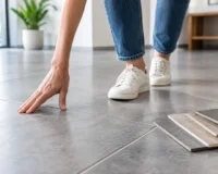
Before committing, order samples and view them where they will be installed. A tile can look entirely different under warm evening lighting than it does in a bright showroom or on a screen. Place samples beside cabinet finishes, countertop materials, paint colors, and fixtures. This small step helps prevent costly second-guessing and makes it easier to see whether undertones truly belong together.
Color Choices That Feel Enduring
Neutral ceramic is far from predictable. Cream, almond, sand, mushroom, soft gray, and chalky white can create a luxurious backdrop when the format and finish are thoughtfully selected. A warm white glazed tile, for example, carries much more depth than a flat painted wall and works across both classic and contemporary interiors.
Color is equally valuable when used with confidence. Deep green, inky blue, terracotta, oxblood, and muted sage can anchor a room and create a memorable focal point. In smaller spaces, a richly colored tile does not necessarily make the room feel smaller. When used across a full wall or wrapped around a vanity zone, it can make the space feel intentional and immersive.
The trade-off is longevity. A vivid tile should be chosen because it genuinely suits the architecture and the people using the space, not because it reflects a passing image trend. If you are drawn to bold color but want flexibility, use it on a backsplash or a single feature wall and keep surrounding finishes more restrained.
Grout Is Part of the Design, Not an Afterthought
Grout occupies more visual area than many people expect, particularly with small tiles. It can sharpen a pattern, soften a grid, or undermine an otherwise beautiful selection if the tone is poorly considered.
For handmade or variation-rich ceramic, a grout that sits close to the tile’s midtone usually creates a cohesive result. With crisp white subway tile, charcoal grout offers graphic definition, while white grout gives a classic, cleaner look. In bathrooms and kitchens, ask your installer about grout products designed to resist staining and simplify ongoing maintenance.
Grout joints also need to respect the tile’s edges and recommended spacing. Trying to force an ultra-tight joint around an irregular handcrafted tile can make the installation look less refined, not more. Good tile design leaves room for the material to look like itself.
Care That Preserves the Finish
Ceramic wall tiles are refreshingly low maintenance. Regular cleaning with a soft cloth or non-abrasive sponge and a pH-neutral cleaner is usually enough for everyday care. Avoid harsh abrasive powders, steel wool, and aggressive chemical products that may dull glazes or affect grout over time.
Pay attention to the tile’s finish and any manufacturer guidance. Some handcrafted, crackle-glazed, or highly textured ceramic products may have particular care or sealing requirements. This is another reason samples and product specifications matter: a finish should suit not only your visual brief but also your appetite for maintenance.
When selecting a premium surface, consider the complete composition rather than the tile in isolation. The warmth of the grout, the direction of the layout, the sheen of the fixtures, and the adjacent materials all shape the final room. Mecca Tiles makes that process easier with curated ceramic options and samples that let you assess color, texture, and finish before the installation begins.
The most successful tiled walls are not chosen to fill a blank surface. They are selected to give the room a lasting sense of character, then installed with the care that character deserves.