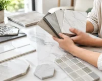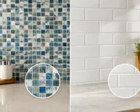
A tile can look quietly refined in a product image, then read entirely differently beside your cabinetry, flooring, and changing daylight. That is precisely why learning how to choose tile samples is one of the most valuable steps in a renovation or new build. A sample turns an appealing idea into a decision you can see, touch, and test in the space it is meant to transform.
For premium surfaces, the goal is not simply to find a tile you like. It is to choose a finish that brings the right balance of color, scale, texture, durability, and character to the room for years to come.
Start With the Room, Not the Sample
Before ordering, define what the room needs to do. A bathroom floor needs secure footing and a surface suited to moisture. A kitchen backsplash can prioritize decorative impact and easy cleaning. An outdoor entertaining area must cope with weather, foot traffic, and the visual transition from inside to out.
This practical brief narrows the field quickly. Consider the room’s level of traffic, exposure to water, direct sunlight, and cleaning demands, then pair those needs with the atmosphere you want to create. Large-format porcelain may give an open-plan living area a calm, architectural feel, while a handcrafted-look ceramic or patterned encaustic tile can bring depth and personality to a smaller zone.
Also consider whether the tile is a feature or a foundation. A boldly veined stone-look porcelain slab may be the focal point in a kitchen, so surrounding finishes should support it. For a floor that runs through several spaces, a more restrained tile can provide the elegant backdrop that lets furniture, art, and joinery stand out.
How to Choose Tile Samples With a Clear Direction
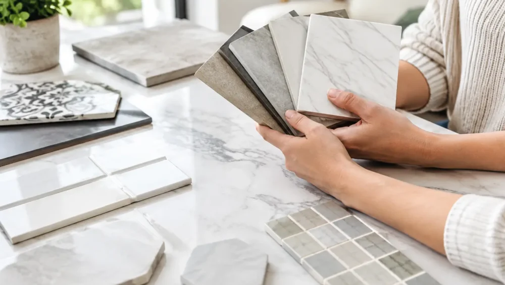
The most successful sample selections begin with a focused palette. Gather a cabinet-door swatch, paint chips, countertop sample, timber finish, fabric, or a photo of any finish that is already fixed. Place these items next to each tile sample rather than judging the tile in isolation.
Color is rarely as simple as white, gray, beige, or black. A white tile may carry warm cream, soft pink, blue-gray, or green undertones. A neutral stone-look surface might lean sandy and welcoming or cool and contemporary. These undertones become more visible when the sample sits against bright cabinetry, natural timber, or a crisp painted wall.
Limit the first round to samples that serve the same design intention. Comparing one warm limestone-look porcelain, one cool concrete-look tile, and one vivid patterned ceramic may be inspiring, but it does not make a final decision easier. Create a small group of close contenders, then compare them carefully in the actual room.
If you are selecting tile for more than one room, decide which finishes need to connect. They do not need to match exactly. In fact, matching every surface can make a home feel flat. A shared undertone, repeated metal finish, or complementary texture often creates a more considered result than identical tile throughout.
View Samples in Real Light, at Different Times
Showroom lighting and screen settings are useful starting points, but your home has its own light story. Take samples into the room and view them in the morning, during the brightest part of the day, and after dark with the intended lighting switched on.
North-facing rooms often make cool tones feel stronger, while warm afternoon light can enrich beige, terracotta, and timber-inspired surfaces. Under artificial lighting, a tile with subtle warmth may feel inviting, whereas a cool gray can become sharper than expected. Move the sample across the room as well. A wall near a window and a shaded shower recess can reveal very different sides of the same finish.
Do not assess the sample only while holding it upright. Lay floor tile flat on the ground, especially near doorways, windows, and adjacent flooring. Hold wall tile vertically near its final location. This simple shift helps you judge reflection, shade variation, and how the surface reads from a normal viewing angle.
Judge Scale Beyond the Small Piece
A single sample cannot show the full rhythm of a tiled surface. This matters with large-format tiles, pronounced veining, patterned designs, mosaics, and natural stone. Ask yourself how the tile’s movement, repeat, and grout lines will look across an entire wall or floor.
For a compact bathroom, a larger tile can reduce grout lines and create a more expansive impression. Yet a smaller format may be the better choice on a shower floor, where additional grout lines can improve grip and make falls easier to manage. There is no universal rule: scale depends on layout, slip requirements, drain placement, and the visual effect you want.
With stone-look porcelain and marble-inspired designs, look at more than one sample if possible. Veins and faces can vary from tile to tile, and that variation is part of the appeal. The same principle applies even more strongly to natural stone, terracotta, and handmade-look ceramics, where tonal shifts and irregularity create a distinctive, layered finish.
Grout deserves a place in the sample review too. A closely matched grout produces a quieter, more continuous surface. A contrasting grout highlights the geometry of the installation and can give subway, square, or patterned tile a more graphic expression. Place a grout swatch beside the sample before committing, particularly with pale tiles where grout can dramatically change the overall look.
Touch the Finish and Test Everyday Practicality
Luxury is not only visual. The right surface should feel appropriate underfoot and stand up to the way the room will be used. Run your hand across the sample. A polished surface may reflect light beautifully in a powder room or on a statement wall, while a matte or textured finish can be a more practical choice for wet areas and busy floors.
For bathrooms, laundries, entryways, pool surrounds, and outdoor spaces, confirm the tile is suitable for the intended application. A finish that looks sophisticated indoors may not offer the slip resistance or weather performance needed outside. Likewise, a highly textured tile can add tactile character but may require more attention when cleaning, especially in a kitchen splash zone.
Think honestly about maintenance. Natural stone brings singular movement and enduring beauty, but some stones may need sealing and considered care. Porcelain can offer a convincing stone, concrete, or timber look with excellent durability and lower maintenance. Neither option is automatically better. The right choice depends on the character you want, the setting, and how much upkeep suits your project.
Compare Samples With Existing Materials
A tile rarely lives alone. It meets cabinet profiles, appliance finishes, tapware, flooring, paint, and natural light. Build a simple material board on a table or in the room itself, then stand back several feet. At close range, you notice texture. From across the room, you see balance.
Look for contrast in at least one element. If the countertop is heavily veined, a quieter backsplash can keep the kitchen composed. If cabinets are a flat, soft neutral, a textured tile may add the depth the space needs. When combining timber and warm stone tones, make sure they share a compatible undertone rather than competing yellow, red, gray, or pink casts.
This is also the moment to consider sheen. Glossy tile beside a honed stone countertop can be striking, but it can also create more visual activity than a compact room needs. Matte-on-matte finishes often feel calm and contemporary, while a carefully placed gloss can bring light to a darker bathroom or laundry.
Order Enough Samples to Make a Confident Decision
One sample is useful for eliminating obvious mismatches. Two to four well-chosen options are better for making a final choice. Avoid ordering every possibility in a large category, which can turn a clear selection process into a crowded comparison.
Give yourself enough time to live with the finalists. Leave them in the room for a few days, revisit them in changing light, and ask how each one supports the larger design. The tile that feels best after repeated viewing is often the one with lasting appeal, not merely the one that makes the quickest first impression.
Once you have chosen, retain the sample until installation is complete. It provides a valuable visual reference for grout selection, trim details, paint decisions, and checking the delivered product before work begins.
A beautifully finished space is built through considered details, and the sample stage is where those details become clear. Choose with both imagination and practical intent, and your tile will do more than finish a room – it will give the entire space its character.