A beautiful tile can lose its impact fast if the grout feels too harsh, too muddy, or simply off. If you’re wondering how to choose grout color, the right answer is rarely just “match the tile” or “go darker for maintenance.” Grout changes the rhythm of a surface, affects how large or busy a room feels, and can either sharpen a layout or let the material speak quietly.
In premium interiors, grout is not a background detail. It is part of the design language. The right choice can make marble-look porcelain feel refined, bring handcrafted zellige to life, or give patterned tile a cleaner, more tailored finish. The wrong one can compete with the material you invested in.
How to choose grout color starts with the tile itself
Before you think about light versus dark, look closely at the tile’s personality. A crisp porcelain subway tile behaves very differently from a tumbled stone, terrazzo, or glazed mosaic. Grout should support that character rather than flatten it.
If your tile has strong variation, such as veining, movement, or tonal shifts, a grout color pulled from one of those existing tones usually feels more sophisticated than a stark contrast. It keeps the surface cohesive and lets the tile remain the focal point. This is especially effective with marble-look porcelain, natural stone, and decorative encaustic-style designs where too much contrast can make the pattern feel fragmented.
With more uniform tile, you have greater freedom. A monochromatic grout creates a calm, expansive look, while a contrasting grout emphasizes shape and layout. That is why white subway tile with medium gray grout reads more graphic and architectural, while the same tile with soft white grout feels lighter and more classic.
Decide whether you want the tile to blend or stand out
This is the core design decision. Do you want to notice the individual tile pieces, or do you want to read the installation as one continuous surface?
Blending grout close to the tile color gives a more seamless result. It can make a small bathroom feel larger, help large-format tile look more expansive, and create a quieter backdrop in spaces where cabinetry, stone, or fixtures already carry visual weight. This approach often suits luxury bathrooms, spa-inspired ensuites, and open-plan flooring where calm continuity matters.
Contrasting grout puts the pattern on display. It outlines each tile and creates definition. In the right setting, that contrast can feel tailored and intentional, especially with subway tile, mosaics, and geometric formats. But there is a trade-off. Strong contrast also highlights lippage, uneven spacing, and every line in the installation. If your goal is a soft, elevated finish, too much contrast can feel busier than expected.
For many projects, the most successful answer sits in the middle. A grout that is slightly darker or softer than the tile often provides enough definition without turning the joints into the main event.
Consider the size of the room and the scale of the tile
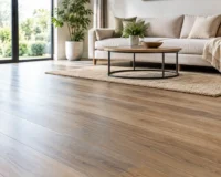
Grout color affects how spacious a room feels. In smaller rooms, matching or near-matching grout tends to visually open the area because the eye is not interrupted by a grid. This is particularly effective with large-format porcelain on floors and walls, where minimal visual breaks create a cleaner, more luxurious impression.
In larger rooms, contrast can be easier to carry because the space has more breathing room. A powder room might benefit from a statement mosaic with visible grout lines, while a large kitchen backsplash can handle a more defined joint pattern without feeling cramped.
Tile size matters too. The smaller the tile, the more grout you will see. On mosaics, penny rounds, and finger tiles, grout becomes a major part of the overall color story. A grout choice that seems subtle on a sample chip can dominate once spread across hundreds of joints. That is one reason grout selection deserves as much attention as the tile itself.
Think practically about maintenance, but do not let it make the decision for you
Maintenance matters, especially in kitchens, showers, mudrooms, and commercial settings. Lighter grout can show staining more easily, while very dark grout may reveal soap residue, mineral deposits, or fading over time. There is no universally low-maintenance grout color. Performance depends on the room, the tile, the grout product, and how the surface is used.
Mid-tone grays, warm taupes, greiges, and soft charcoals often strike the best balance. They are forgiving without looking heavy. They also tend to pair beautifully with the premium neutral palettes popular in contemporary interiors.
That said, practicality should support the design, not override it. If a soft off-white grout is what gives your bathroom the clean, tailored finish you want, that may still be the right choice. You simply need to pair it with the right grout type and realistic care expectations.
Lighting changes everything
A grout color that looks perfect under showroom lighting can shift noticeably at home. Natural daylight, warm LEDs, cool overhead fixtures, and shadows in wet areas all affect how grout reads once installed.
Cool gray grout can look blue in some bathrooms. Warm beige grout can turn more yellow against a bright white tile. In dimmer rooms, darker grout may feel heavier than it did on a sample board. This is why viewing grout alongside your tile in the actual space is so valuable.
If you are choosing between two close options, step back and consider the fixed elements around the tile as well. Countertops, paint, cabinetry, timber tones, and metal finishes all influence whether a grout feels clean, warm, sharp, or muddy.
How to choose grout color for popular tile looks
Some combinations consistently work well, but they still depend on the mood you want.
For white or off-white subway tile, white and soft gray remain the most versatile. White gives a fresh, classic look. Soft gray adds definition with a slightly more contemporary edge. Black grout can be striking, but it is a stronger design move and suits more graphic interiors.
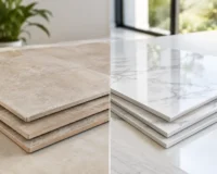
For marble-look porcelain, grout that matches the background tone usually looks most elevated. Bright white grout can feel too stark, while a gray drawn from the veining often creates a more custom, considered finish.
For natural stone, avoid anything too flat or artificial-looking. Warm grays, taupes, and sand tones typically complement stone best because they respect its natural variation.
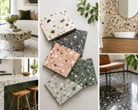
For patterned or encaustic-style tile, grout is usually at its best when it recedes. A quiet neutral allows the pattern to lead. High-contrast grout can make a detailed floor look cluttered.
For dark tile, matching grout can deliver a dramatic, monolithic effect. A lighter grout will emphasize each tile and can work well if you want geometry and contrast, though it usually creates a busier finish.
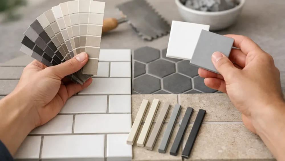
Do not choose from a tiny swatch alone
Grout is one of those materials that rarely looks the same on a paper chart as it does across a finished wall or floor. The joint width, the texture of the tile, the amount of visible grout, and even the drying process can all affect the final appearance.
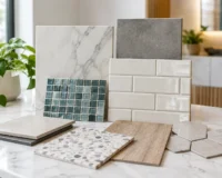
If your project is design-led, samples are not a luxury. They are part of making a confident decision. Place your tile with two or three grout candidates and view them morning, afternoon, and evening. This is especially worthwhile for high-impact surfaces like a full-height backsplash, a feature bathroom wall, or an open living floor where the finish will be seen every day.
A premium result usually comes from small decisions made carefully. Grout is one of them.
A few common mistakes to avoid
The most common mistake is treating grout as an afterthought and picking whatever seems safest on installation day. Another is choosing maximum contrast without considering how much grout will actually be visible. What looks bold and elegant on a single sample tile can become visually noisy across a full shower or floor.
It is also easy to ignore undertones. Two grays can behave completely differently if one leans blue and the other leans warm. When your tile has beige, cream, taupe, or stone-inspired variation, a cool grout can feel disconnected even if it seems close in value.
Finally, do not forget the setting. A backsplash can handle more definition because it is viewed at eye level and usually broken up by cabinetry and appliances. A large floor runs continuously and often benefits from a more integrated grout color.
When the goal is a polished, high-end finish, grout should feel intentional. It should support the scale of the tile, the mood of the room, and the way the surface will be lived with over time. If you are narrowing down options, ordering tile samples first makes the decision far easier. Brands such as Mecca Tiles build that process around design confidence, which is exactly what grout selection deserves.
The best grout color is the one that makes your tile look even more expensive than it already is.