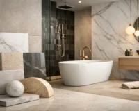
A bathroom can miss the mark even when every individual tile is beautiful. The wall tile may feel elegant, the floor tile may be durable, and yet together they compete instead of connect. That is usually the real question behind how to match wall and floor tiles – not whether they should be identical, but how to make them feel intentional in the same space.
The good news is that strong tile pairing is less about rigid rules and more about balance. When color, scale, finish, and material are working together, a room feels elevated, considered, and quietly luxurious. When one of those elements is off, the result can feel busy, flat, or visually disconnected.
How to Match Wall and Floor Tiles Without Making the Room Feel Busy
The cleanest way to approach tile pairing is to decide what should lead the room. In some spaces, the floor is the feature and the wall plays a supporting role. In others, a striking wall tile sets the tone while the floor grounds the scheme. Trying to make both surfaces equally dominant often creates visual noise, especially in smaller bathrooms, laundries, and powder rooms.
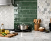
If you are working with a patterned encaustic look, terrazzo, or bold veining, let that tile take center stage and keep the companion tile more restrained. A soft matte porcelain on the walls can give a decorative floor room to breathe. If your wall tile is sculptural, glossy, or richly toned, the floor often works best in a quieter finish and a simpler format.
This is where many projects become more refined. Matching does not mean repeating the same tile everywhere. More often, it means selecting two tiles that share a visual language.
Start With Color Temperature, Not Exact Color
One of the most reliable ways to create cohesion is to match undertones rather than exact shades. Warm white walls tend to pair well with soft beige, sand, taupe, or warm gray floors. Cooler whites usually sit better with charcoal, concrete looks, blue-grays, or crisp marble visuals.
This matters because even subtle clashes can shift the entire feel of a room. A creamy wall tile beside a stark cool-gray floor can feel accidental rather than curated. By contrast, two different colors with the same temperature usually feel polished together.
Natural stone looks and marble-look porcelain make this easier because they often contain multiple tones. You can pull a floor tile from the secondary color within a wall tile, or vice versa. That approach creates connection without becoming too matched.
If the room gets limited natural light, be careful with dark-on-dark combinations unless the goal is a moody, intimate effect. Deeper tones can look exceptional in a well-designed powder room or boutique-inspired bathroom, but they need enough contrast in texture, lighting, or fixture finish to avoid feeling heavy.
When Monochrome Works Best
A monochrome palette is often the most elegant answer for contemporary interiors. Soft white walls with a pale stone-look floor, or warm greige walls with a slightly deeper floor tile, can make a room feel expansive and calm.
The trick is to vary at least one detail. That might be scale, finish, or texture. If both wall and floor tiles are the same color and surface quality, the room can fall flat. A matte floor paired with a satin or lightly textured wall adds subtle definition while keeping the overall palette quiet.
Use Contrast Carefully
Contrast gives a room shape, but too much can cut the space into pieces. High-contrast pairings such as bright white wall tiles with very dark flooring can look dramatic and sophisticated, especially in architectural spaces. They can also make compact rooms feel smaller if the transition is too abrupt.
A more premium result often comes from softened contrast. Think ivory walls with mushroom-toned floors, or pale marble-look walls with a charcoal porcelain floor that picks up the stone veining. The difference is visible, but the palette still feels resolved.
If you love bold contrast, use repetition elsewhere to unify the design. Black floor tiles can connect beautifully to black tapware, vanity hardware, or window frames. Deep green walls can feel grounded by a neutral floor if the same green is echoed in joinery or styling.
Scale Changes Everything
Tile size has a major effect on how wall and floor combinations read. Large-format wall tiles can feel sleek and expansive, especially when paired with minimal grout lines. Smaller floor tiles often bring practicality, particularly in wet areas where extra grout lines can improve slip resistance.
That difference in scale is not a problem. In fact, it often creates a more sophisticated result than using one size throughout. Large wall tiles with smaller mosaics or kit-kat floor tiles can look highly considered because they introduce variation without changing the whole palette.
What tends to be less successful is mixing too many competing formats in one room. If the floor is a small pattern mosaic, the wall usually benefits from a calmer shape. If the walls feature stacked finger mosaics or handmade-look subway tiles, the floor often looks stronger in a larger, simpler format.
Should Wall and Floor Tiles Be the Same Size?
Sometimes, especially in minimalist spaces, yes. Using one tile in the same size or in coordinated formats can create a quiet, architectural finish. This works particularly well with concrete looks, limestone visuals, and refined porcelain ranges.
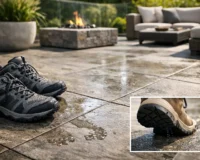
But it depends on the room and the purpose. Floors need to perform. In bathrooms and outdoor transitions, a tile that looks beautiful on the wall may not offer the slip rating or texture needed underfoot. Design should always meet function.
Texture and Finish Need as Much Attention as Color
When people think about how to match wall and floor tiles, they usually focus on pattern and shade first. Finish is just as important. Glossy wall tiles reflect light and can make a room feel brighter and more layered. Matte floor tiles usually feel more grounded, contemporary, and practical.
That pairing works well because it creates contrast through surface quality rather than through strong color change. A glossy zellige-look wall tile with a matte stone-look floor, for example, feels dimensional and premium without appearing overdesigned.
Textured walls can also be highly effective, especially in neutral schemes. Fluted, ribbed, or handmade-look surfaces add depth when the color palette is restrained. If you choose a textured wall tile, a smoother floor usually keeps the room from feeling too busy.
Match the Style Story of the Space
The most successful tile combinations share a design direction. A luxurious marble-look wall tile may not feel right with a rustic terracotta floor unless the project is deliberately eclectic and the rest of the room supports that contrast. Likewise, a sleek concrete-look floor may feel disconnected from a traditional glossy subway wall tile if there is no element tying them together.
Ask what the room is trying to say. Is it spa-like and serene, bold and boutique-inspired, coastal and relaxed, or tailored and architectural? Once the style story is clear, tile decisions become far easier.
For a soft contemporary bathroom, consider tonal stone looks, warm neutrals, and understated texture. For a more decorative interior, patterned floors paired with plain walls often create the right balance. For commercial spaces or high-use residential zones, porcelain surfaces that combine elevated visuals with durability are often the smartest fit.
Think About the Whole Room, Not Just the Tile Pairing
Wall and floor tiles do not exist in isolation. Vanity finish, cabinetry tone, grout color, metal accents, paint, and lighting all influence whether a combination feels resolved. A tile pairing that looks slightly cool on its own may come to life beside warm timber joinery. A subtle floor may feel much richer once grout and fixtures are selected.
Grout deserves more attention than it usually gets. Matching grout creates a quieter, more continuous effect. Contrasting grout emphasizes shape and layout. Neither is universally better. It depends on whether you want the tile itself to stand out or the room to read as more unified.
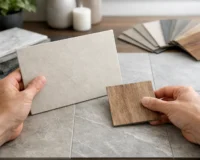
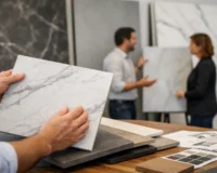
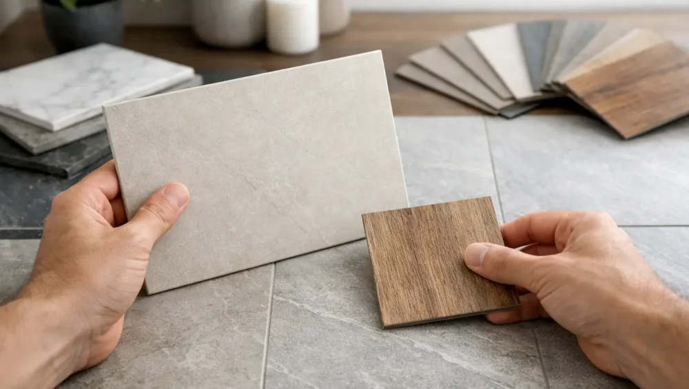
This is also why samples matter. A tile can look very different under showroom lighting than it does in your bathroom, kitchen, or entry. Viewing wall and floor options together, in the actual space, is one of the simplest ways to make a more confident decision.
How to Match Wall and Floor Tiles in Different Rooms
Bathrooms usually benefit from a layered approach: practical slip-resistant flooring, more decorative freedom on the walls, and a palette that feels calm rather than fragmented. Kitchens often call for more restraint on the floor because cabinetry, countertops, and backsplashes already add visual information. Laundry rooms can carry stronger pattern or color in smaller doses, while still benefiting from durable porcelain underfoot.
In open-plan spaces, continuity matters more. If the floor tile extends through multiple zones, wall tiles should complement that broader palette rather than compete with it. The aim is a home that feels connected from room to room, not like a sequence of unrelated material decisions.
At Mecca Tiles, this is where a curated range makes a difference. When surfaces are selected with both design impact and real-world performance in mind, it becomes much easier to create spaces that feel elevated and enduring.
The best tile pairings do not shout for attention. They create rhythm, depth, and confidence the moment you walk into the room. If you start with undertone, let one surface lead, and balance beauty with practicality, the final result will feel less like a guess and more like a finished design.